Concept project
RichaCart, shop smart
A concept e-commerce app built around one question: how do buyers know which product and which seller to trust?
- Role
- UI/UX Designer, end to end
- Timeline
- About 4 months
- Tools
- Figma, FigJam, Google Docs, ChatGPT
- Platform
- Mobile app, plus a responsive landing page
2
user types (buyers and sellers)
Design scope
7
IA sections
Design scope
3
landing page breakpoints (desktop, tablet, mobile)
Design scope
The problem
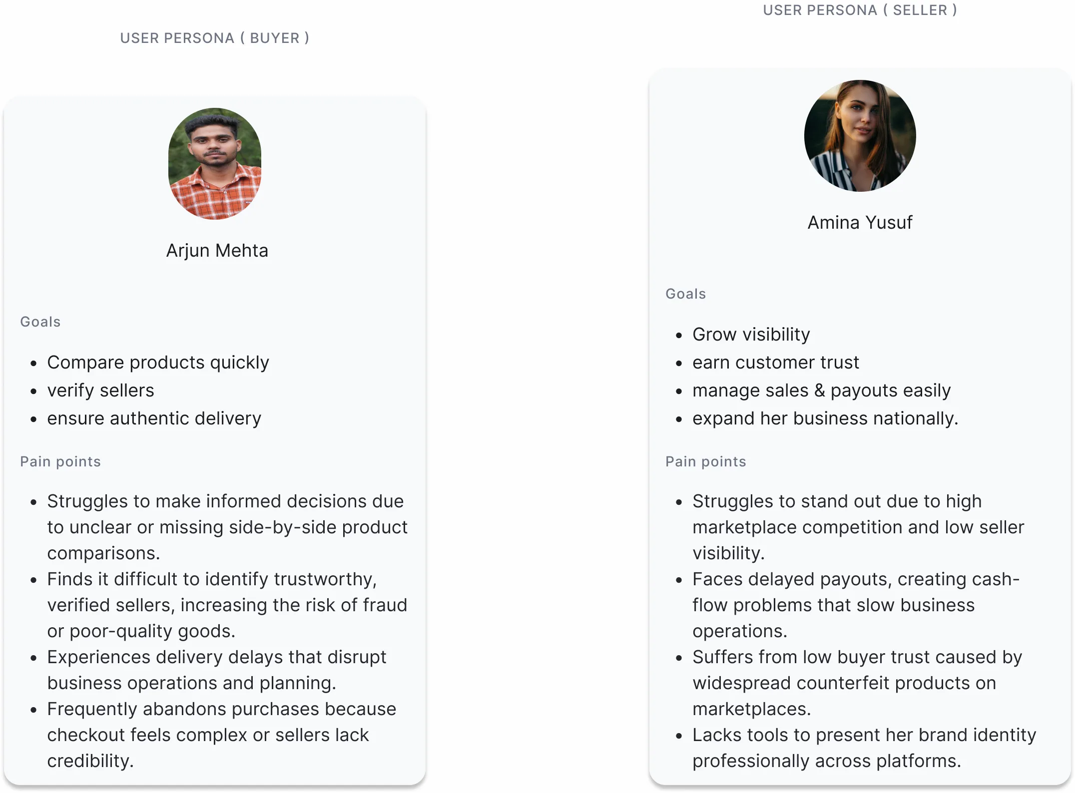
Buyers struggle to compare similar products quickly and to know which sellers they can trust. Sellers struggle to prove they're genuine and to be seen in a crowded marketplace. Both sides lose: buyers abandon carts, and good sellers get lost among counterfeits.
Research
I used competitive analysis (including Jumia), personas and empathy mapping, and flow sketches. What stood out: buyers wanted fast checkout, clear comparisons and reliable sellers, sellers wanted visibility and trust badges, competitors were heavy on desktop and thin on mobile, and feature overload was a common complaint.
Deciding what to build first
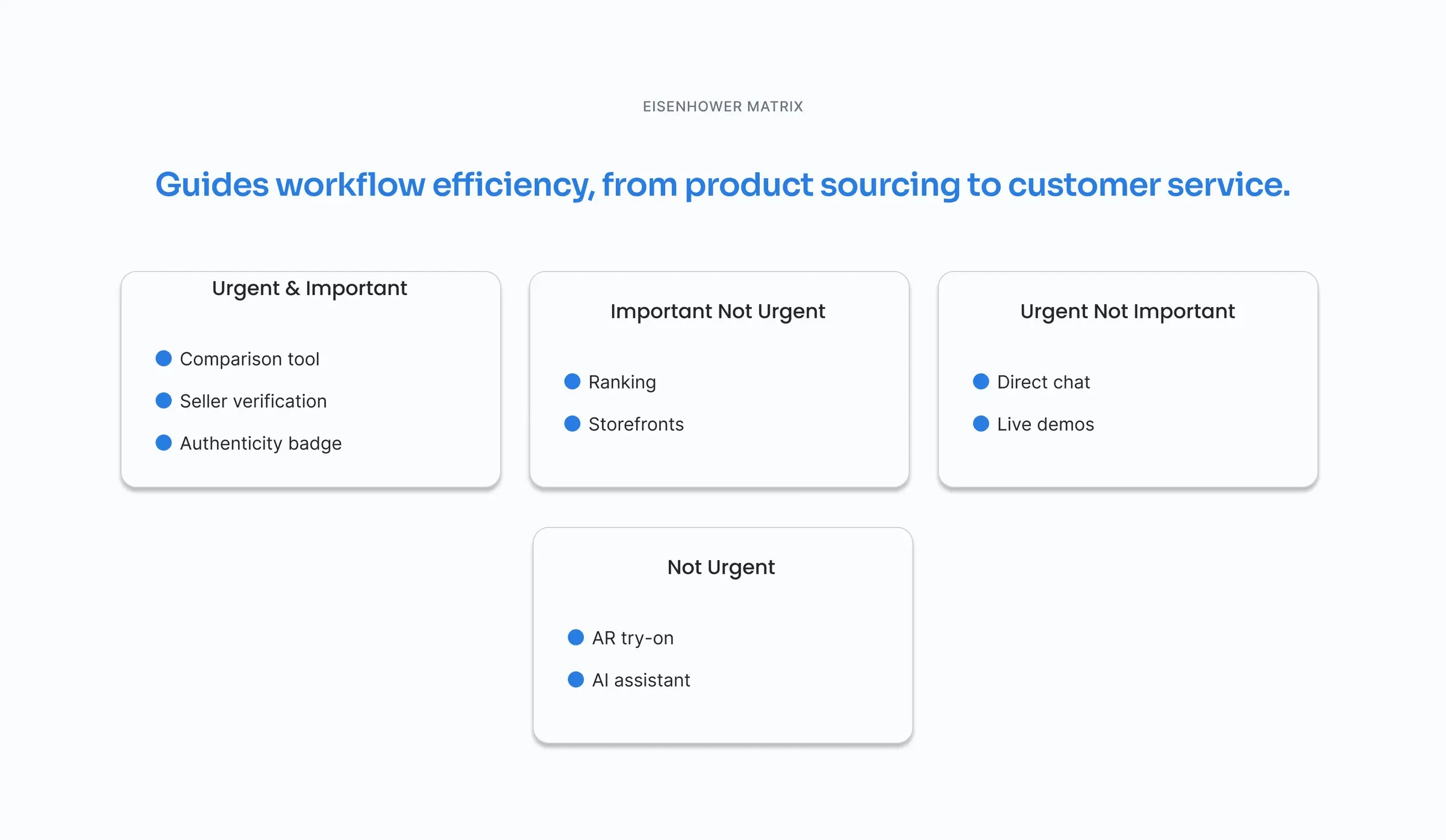
I used an Eisenhower matrix to keep the first version focused. The comparison tool, seller verification and the authenticity badge came first. Ranking and storefronts came next. Direct chat and live demos were nice-to-haves. AR try-on and an AI assistant were parked for later.
Structure and journeys
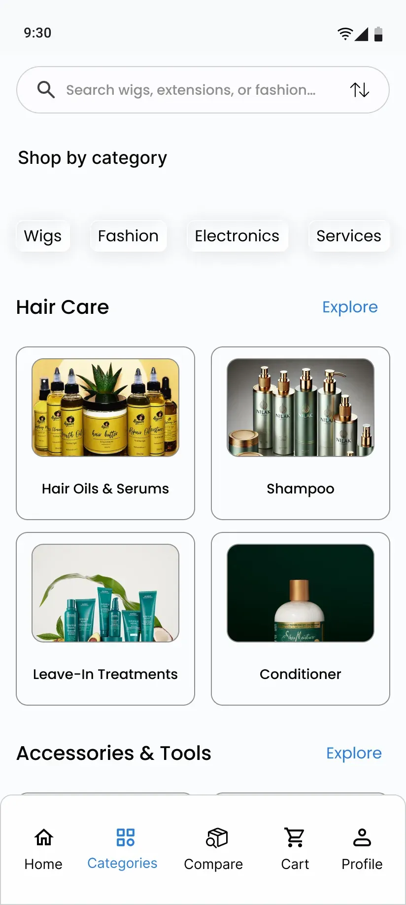
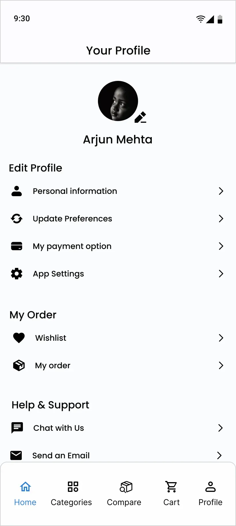
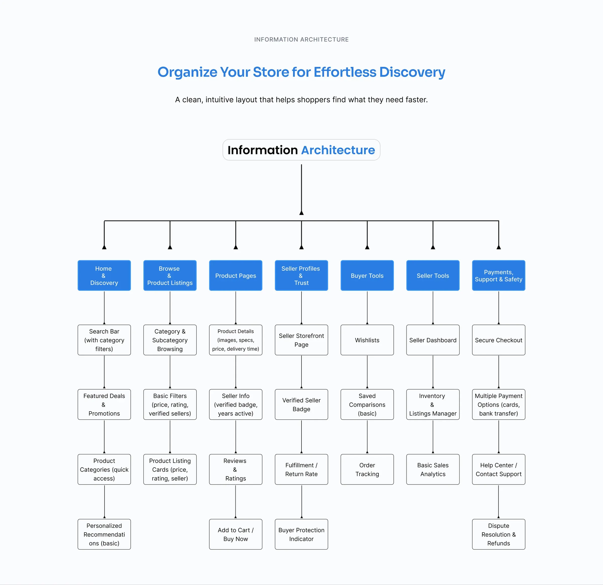
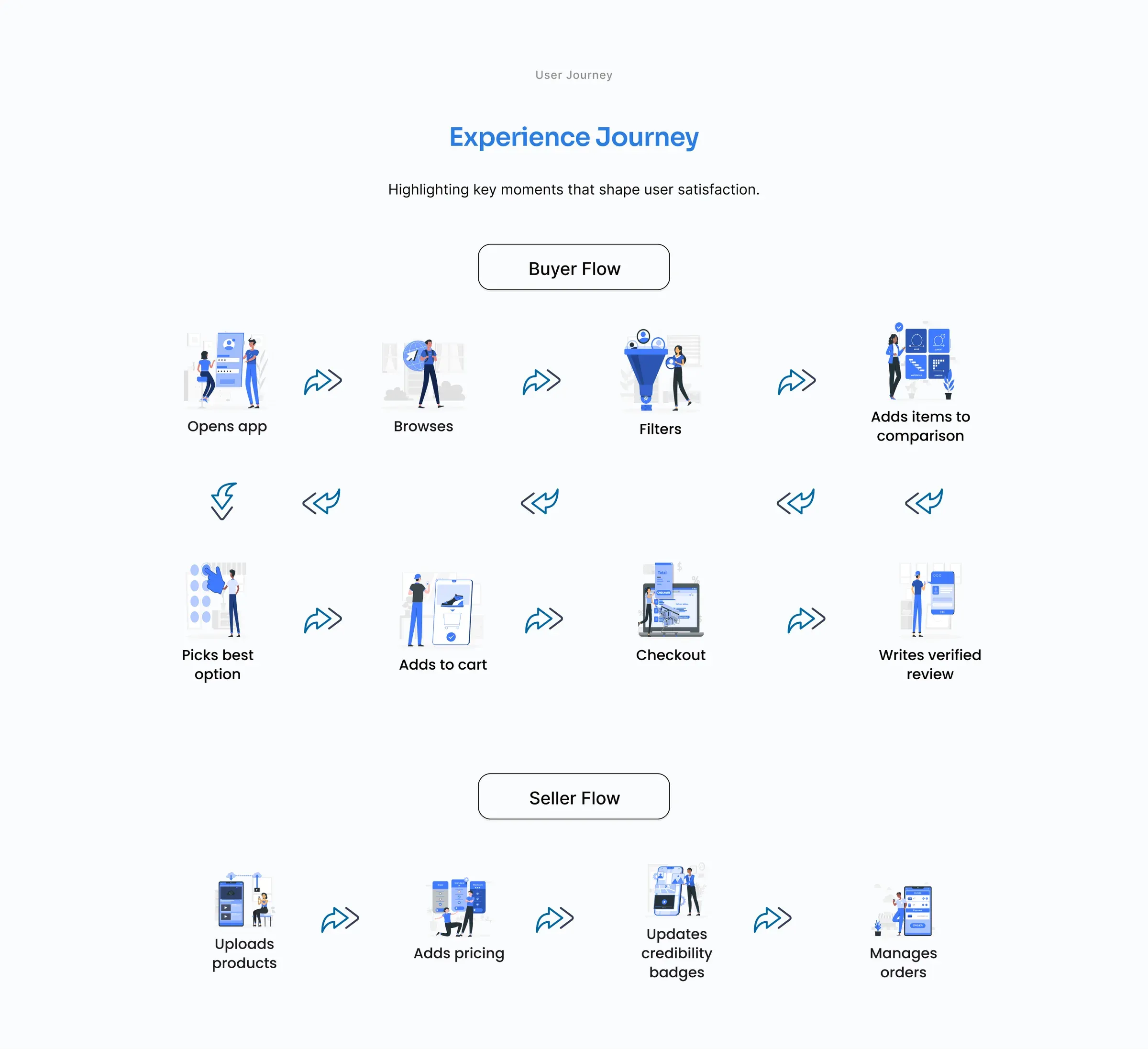
I mapped the information architecture into seven areas, from home and discovery to payments, support and safety. Then I mapped two journeys: the buyer's (browse, filter, compare, pick, check out, review) and the seller's (upload, price, earn credibility badges, manage orders).
From wireframes to final screens
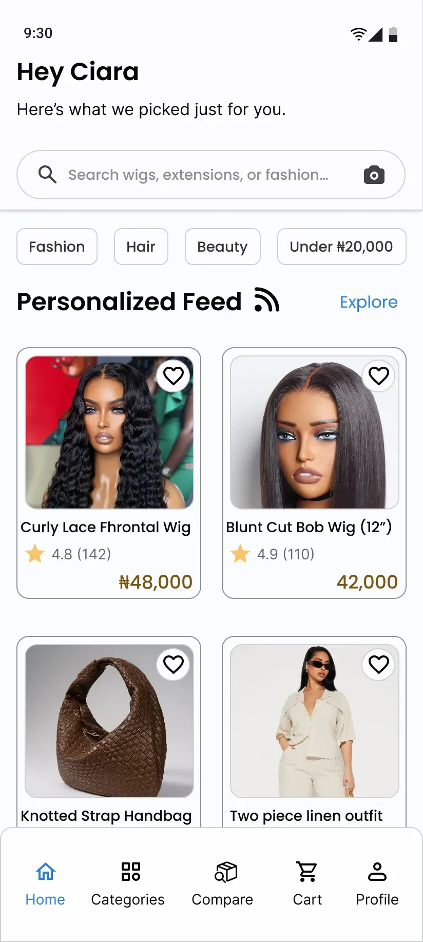
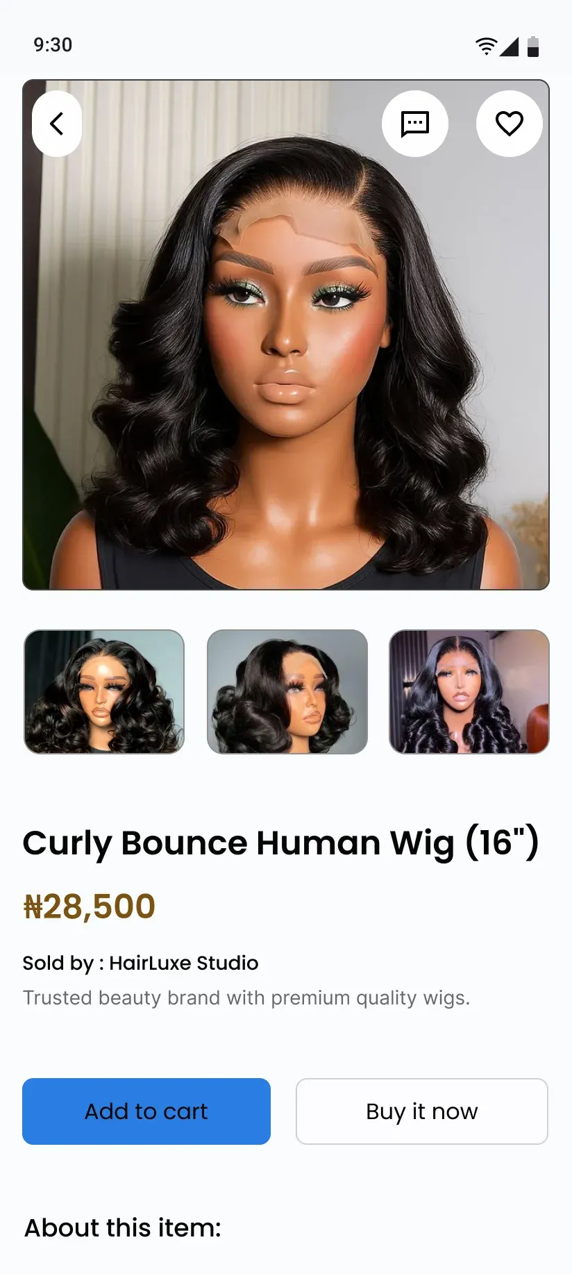
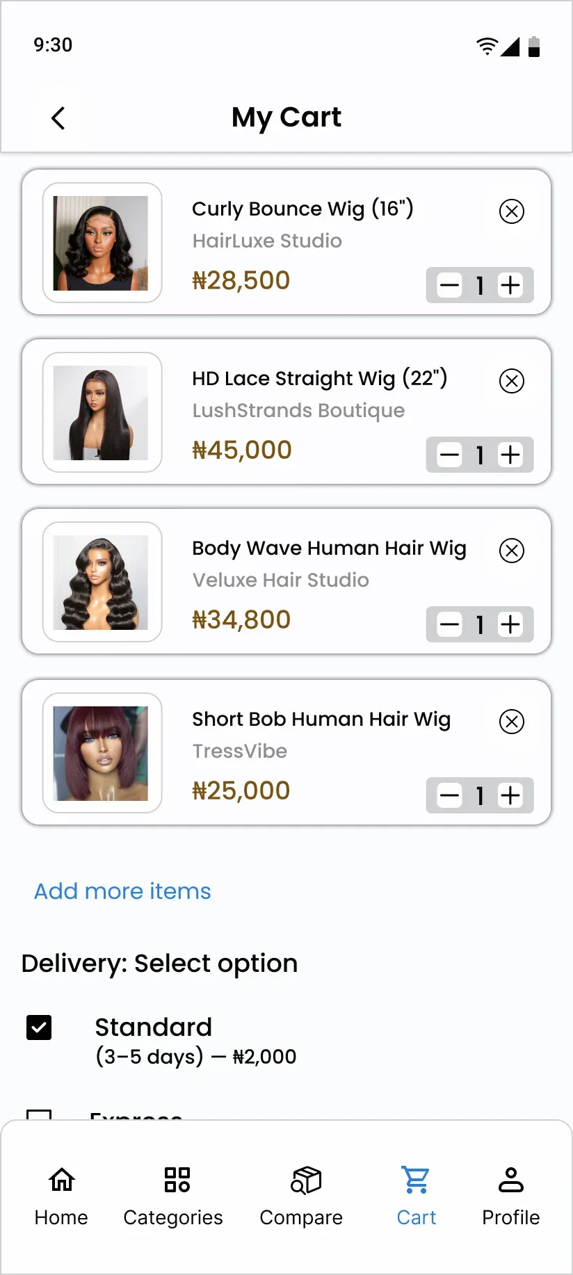
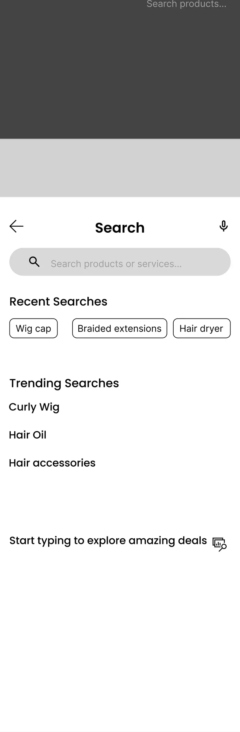
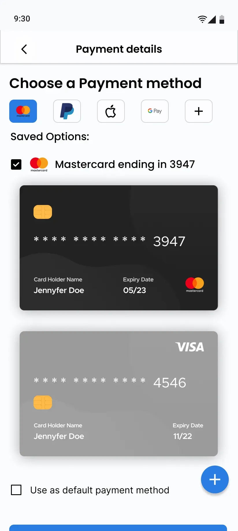
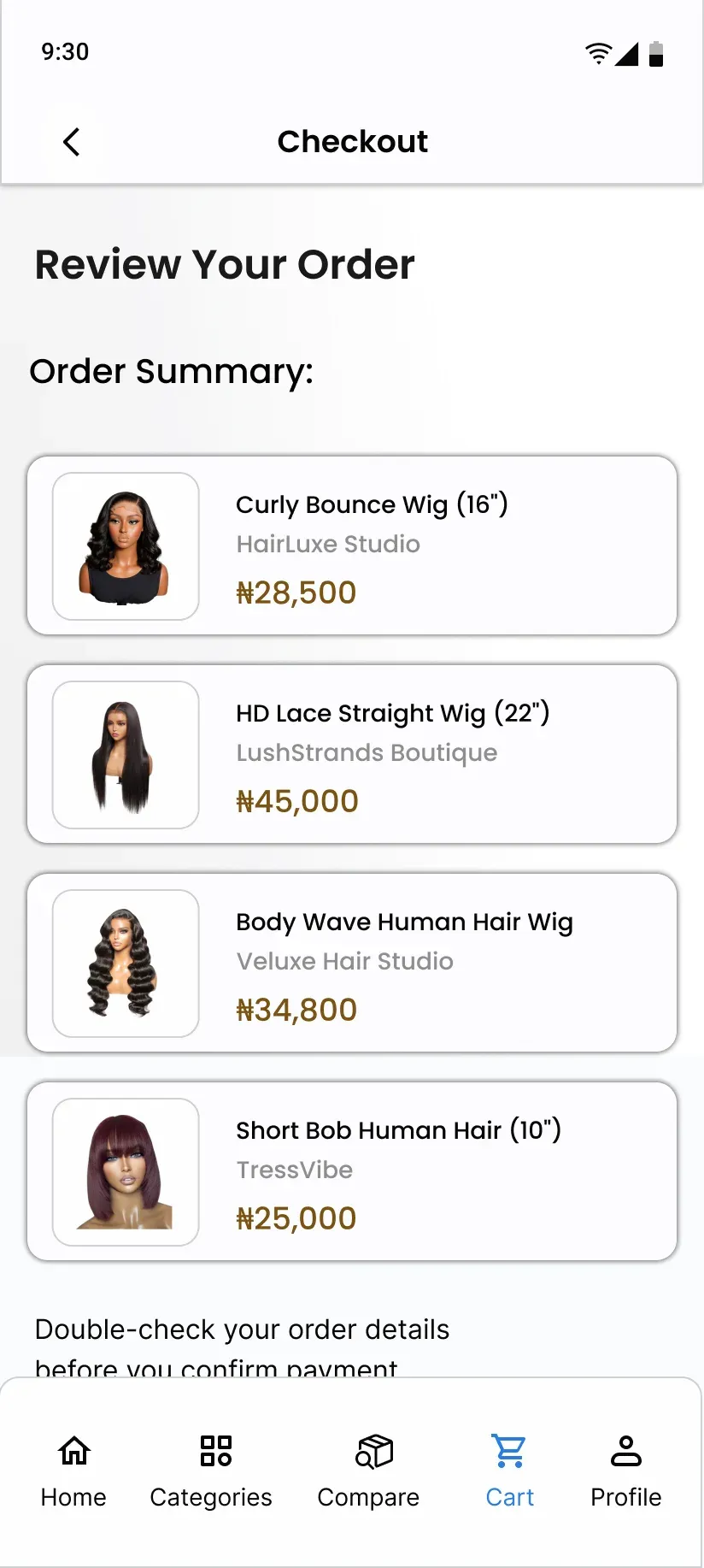
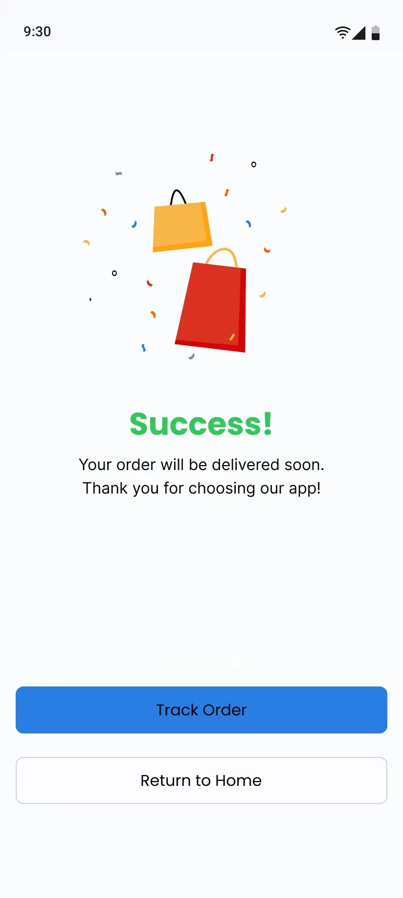
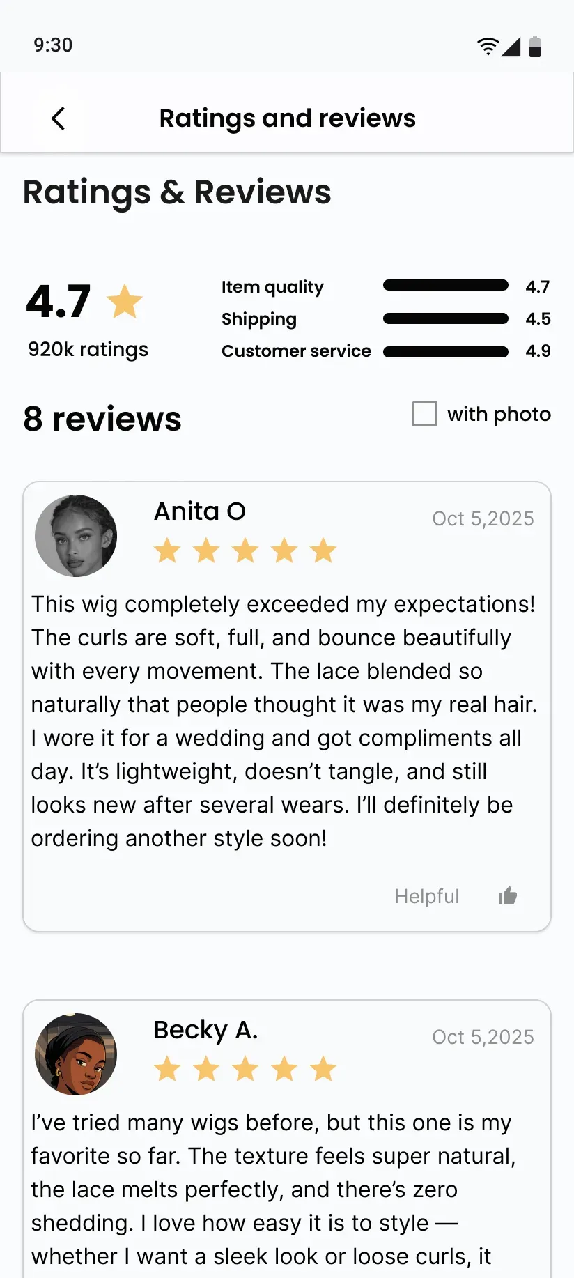
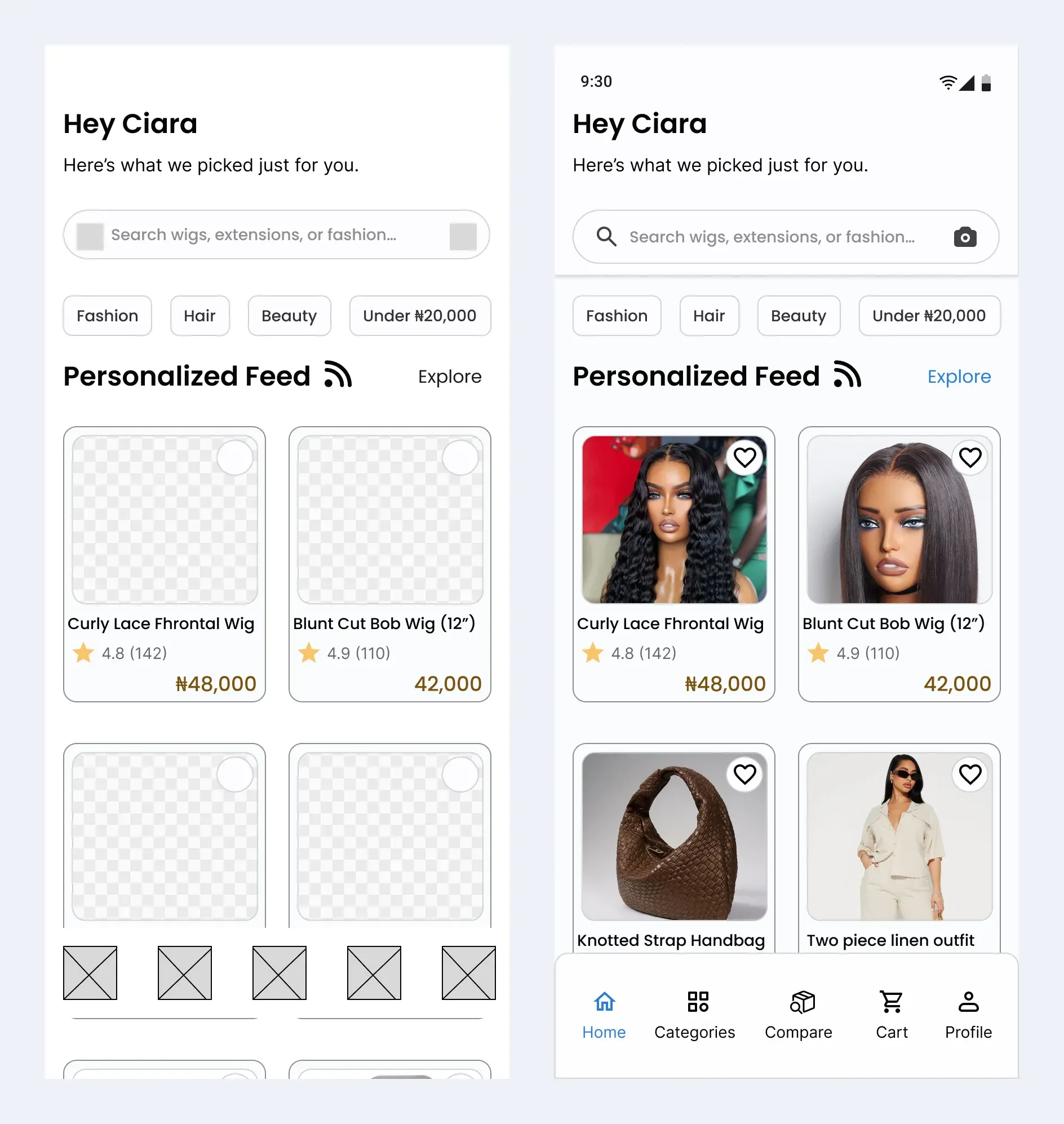
Mid-fidelity wireframes set the structure, hierarchy and spacing. High fidelity added colour, type and accessibility. The core features are side-by-side comparison, verified seller badges, an authenticity guarantee, a seller bulk calculator and reviews with photos.
Design system
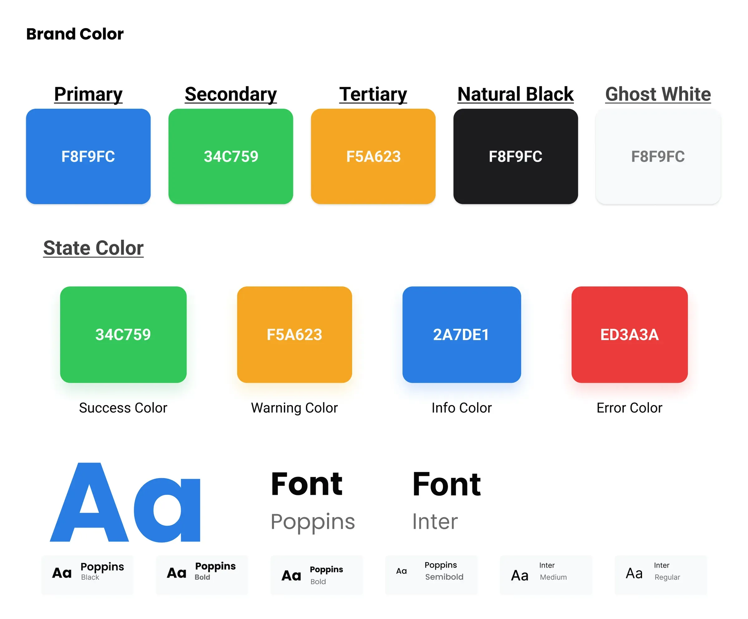
Primary blue #2A7DE1, secondary green #34C759, accent orange #F5A623, with neutrals and success, error and warning colours. A 4px spacing grid, consistent radius tokens, icon sizes of 16, 20, 24 and 48, and full button states.
A responsive landing page
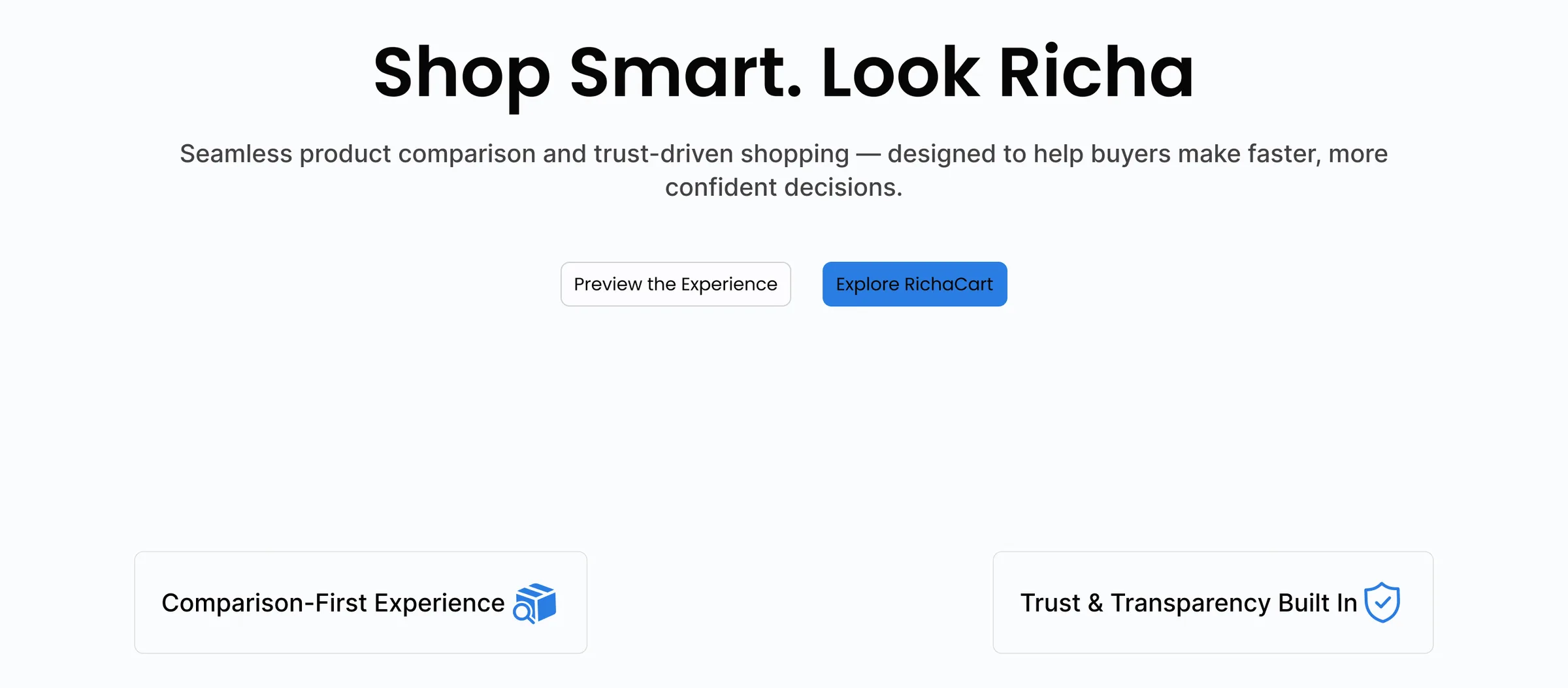
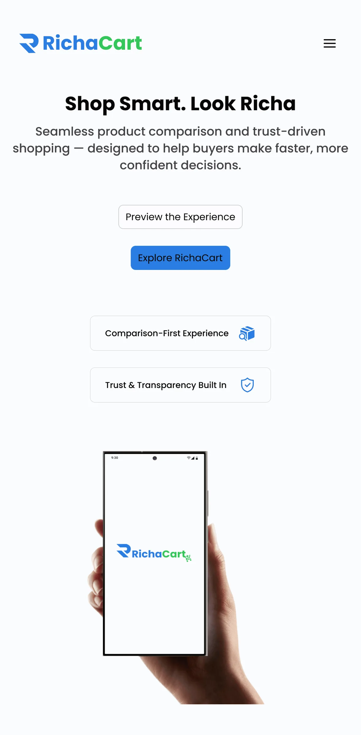
I designed the RichaCart landing page at desktop, small desktop, tablet and mobile, including a hamburger navigation for small screens.
What I learned
Balancing clarity with minimalism was the hard part, especially on long product pages. If I took RichaCart further, I'd test the comparison flow with real buyers first, then add smart search suggestions, a short first-time onboarding and stronger trust markers.