Client project · 2026 · Lagos
CreatorsRewards, brands pay for results
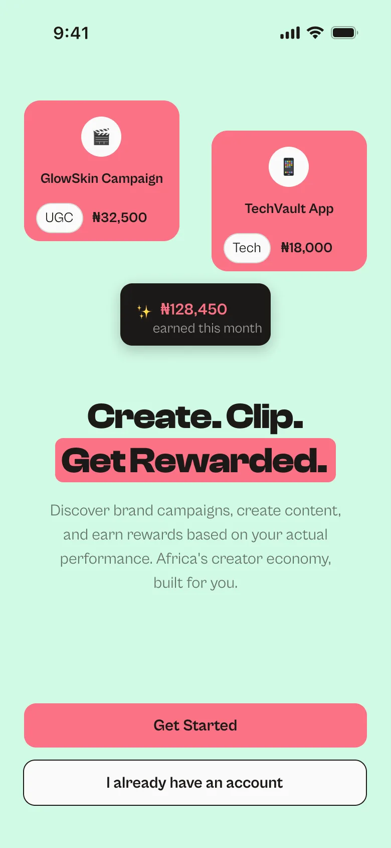
A creator platform for Africa that connects UGC creators, clippers and influencers with brands that pay for results, not promises.
- Role
- UX research, UX documentation, design system and UI design. I worked directly with the client, and built the live site together with my friend Gomez Praise.
- Tools
- Figma, FigJam, Figma Make, Microsoft Word, Claude
- Platform
- Responsive web app: mobile-first for creators and brands, desktop for admins
44
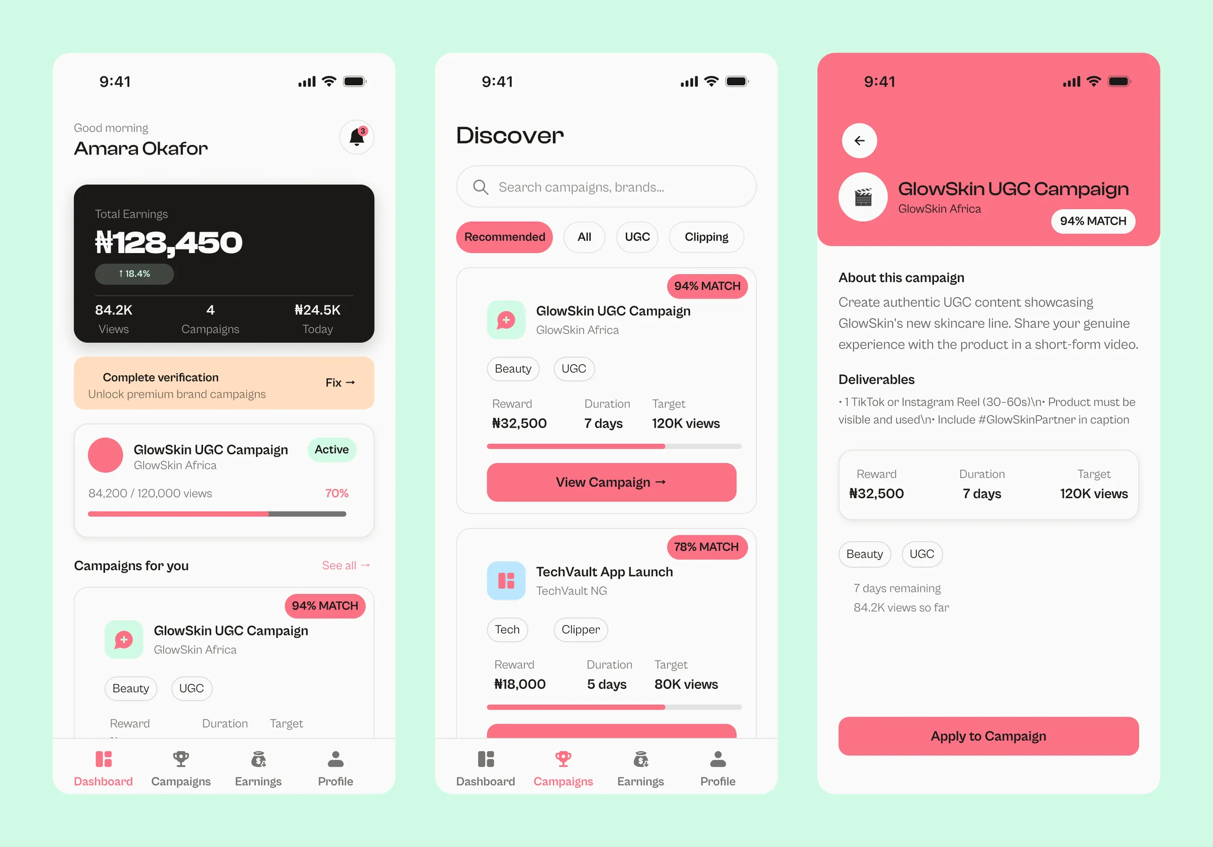
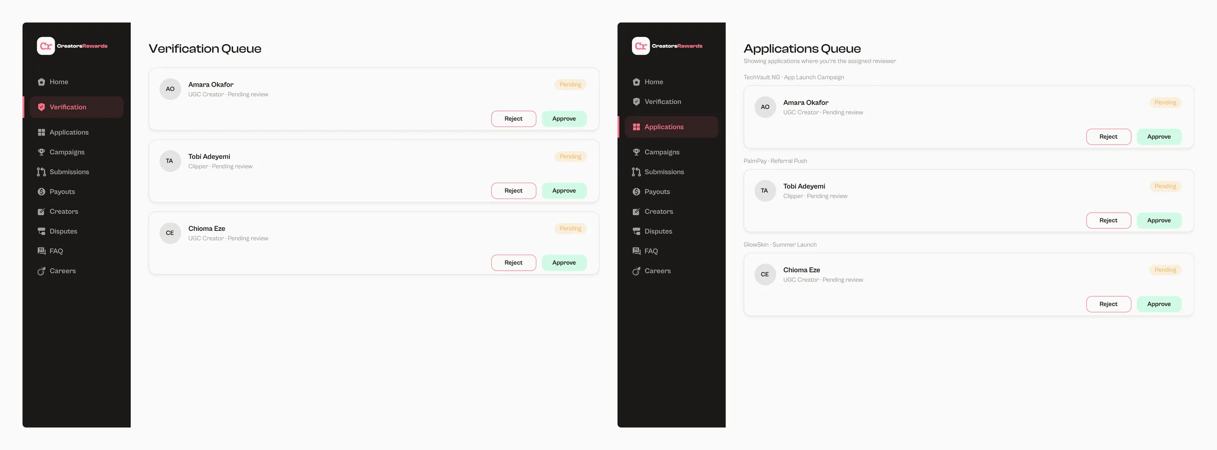
Creator app screens, plus 2 modals
Design scope
17
Admin screens for desktop
Design scope
7
user flows mapped
Design scope
3
roles: creator, brand and admin
Design scope
5
personas
Design scope
~40
prototype connections
Design scope
The brief
Brands in Nigeria that work with creators mostly do it through DMs, spreadsheets and personal bank transfers. There's no shared place to find creators who can deliver, no standard way to review content before it goes live, and no record of what was promised against what was paid. Brands waste budget, and creators do real work with no guarantee they'll be paid.
The client wanted one platform where brands pay for results, not promises, starting in Nigeria, with payouts in naira and USDT.
What the research showed
I looked at the closest products before designing anything:
- ClippaPay is Nigeria-first and combines UGC, clipping and affiliate work.
- Diglancers is a creator database for Africa, but campaigns run off the platform.
- Global clipping platforms compete on pay rates and fraud detection.
One finding shaped more decisions than any other. Users of a similar platform complained publicly about content rejected with no explanation, and about rules that changed after their work was already approved. So I made two rules:
- Every rejection carries a written reason.
- A campaign's brief is locked once it goes live.
Three roles, one system
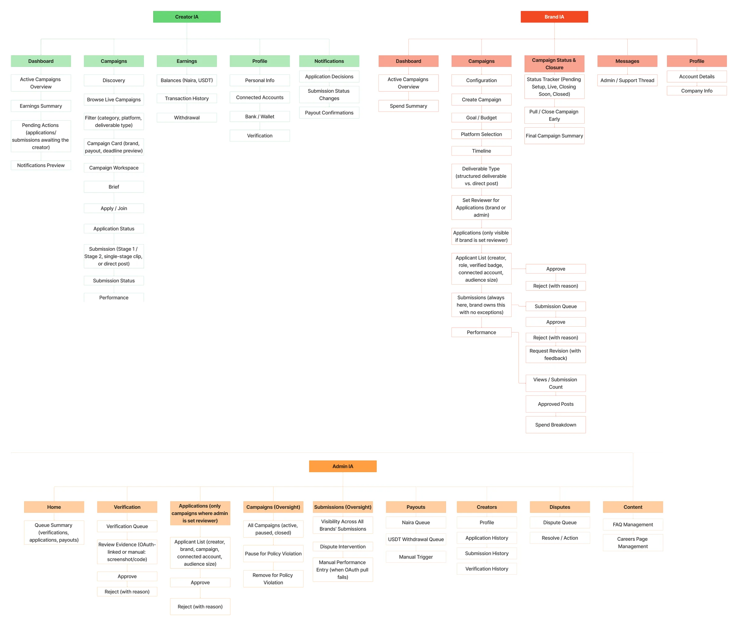
The platform has three roles:
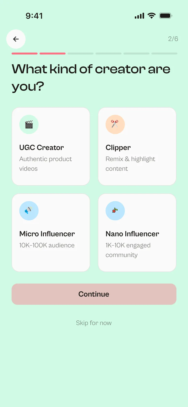
- Creators: UGC creators, clippers and micro and nano influencers. They find campaigns, submit work and withdraw earnings.
- Brands: they create campaigns, review submissions and track spend.
- Admins: they keep the marketplace trustworthy without becoming a bottleneck.
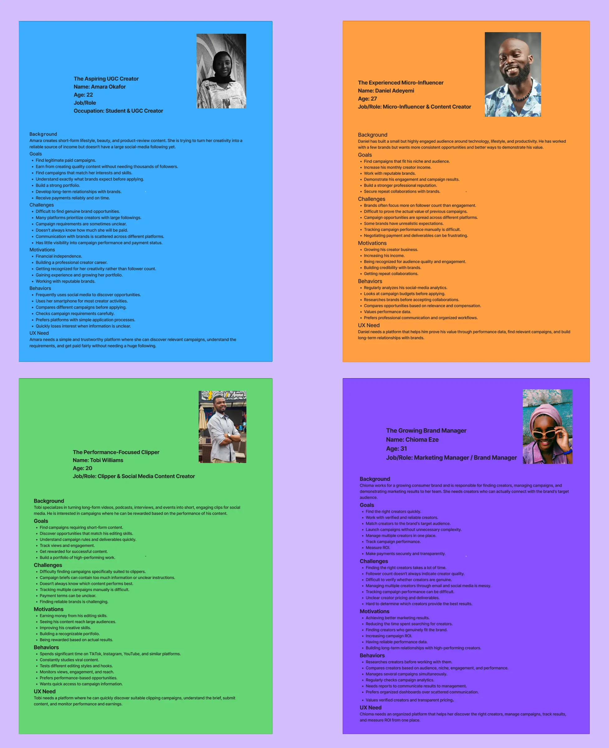
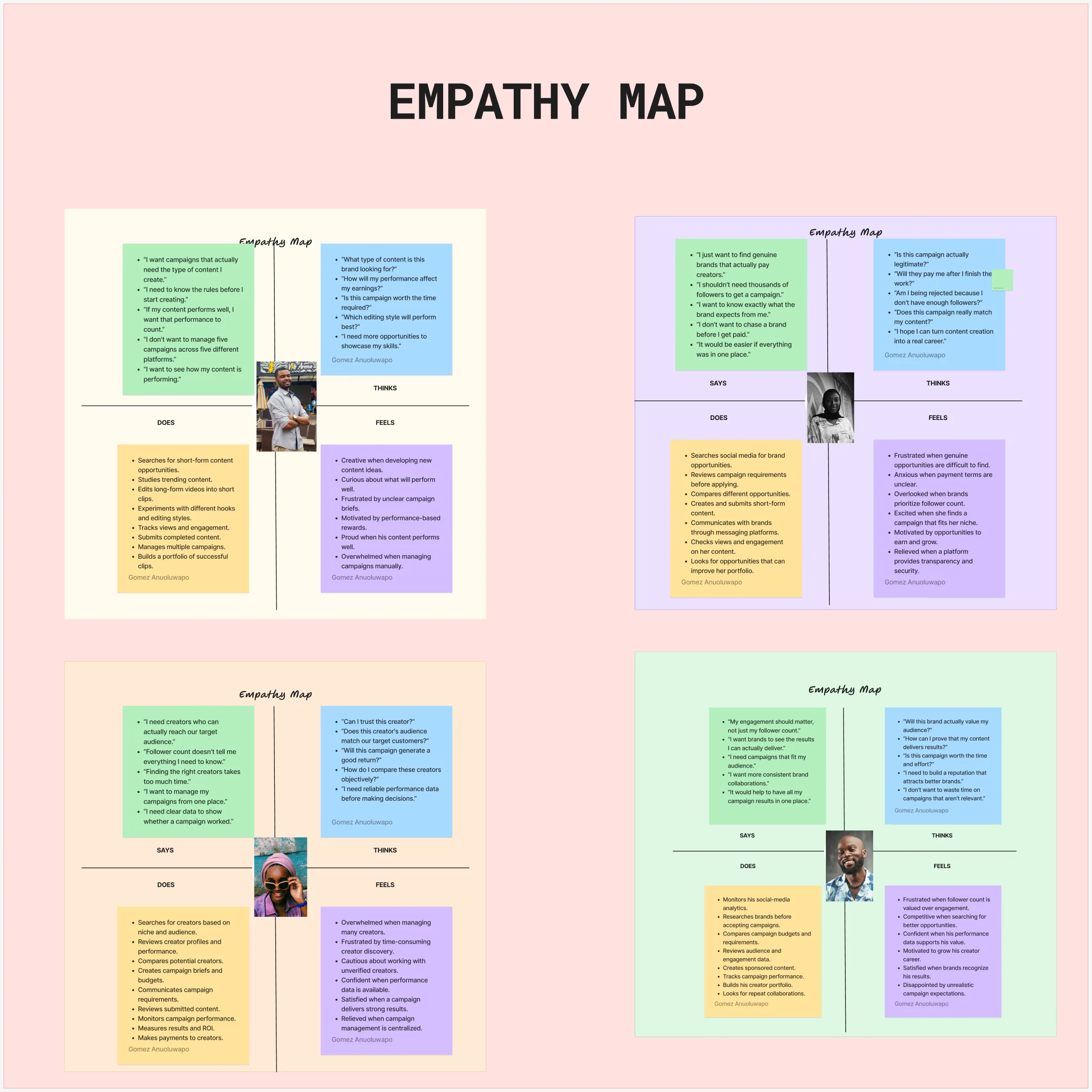
Five personas kept me honest about who each screen was for: Amara (UGC creator), Daniel (micro influencer), Tobi (clipper), Chioma (brand manager) and the admin.
Before designing screens, I mapped user stories, the information architecture, a sitemap, journeys for every persona and seven user flows in FigJam. All of it went to the client as written UX documentation. We only started designing once they had checked it and approved it.
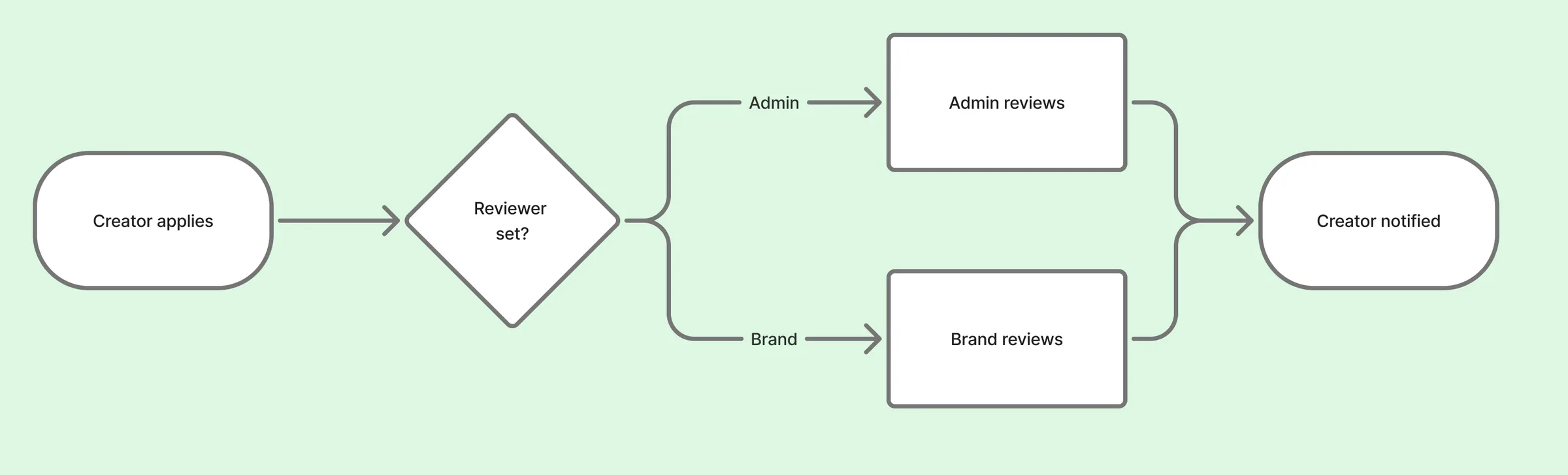
Most of the system is deliberately linear. The one place it branches is application review: when a brand creates a campaign, it chooses whether the brand or an admin reviews creator applications. Creators never see which path they're on, so the experience stays simple for them.
Decisions that changed along the way
Client work means direction changes. Here are the ones that shaped the product:
- Brands set up their own campaigns. The first model had brands requesting campaigns and admins setting them up. The client reversed that, so I redesigned campaign creation as a five-step flow brands complete themselves.
- Micro and nano influencers got their own sign-up path. The client first wanted them folded into the UGC path. The reference build showed four separate creator types, and we agreed to follow it.
- Brand navigation grew to five tabs, and Messages moved to an icon, like Notifications.
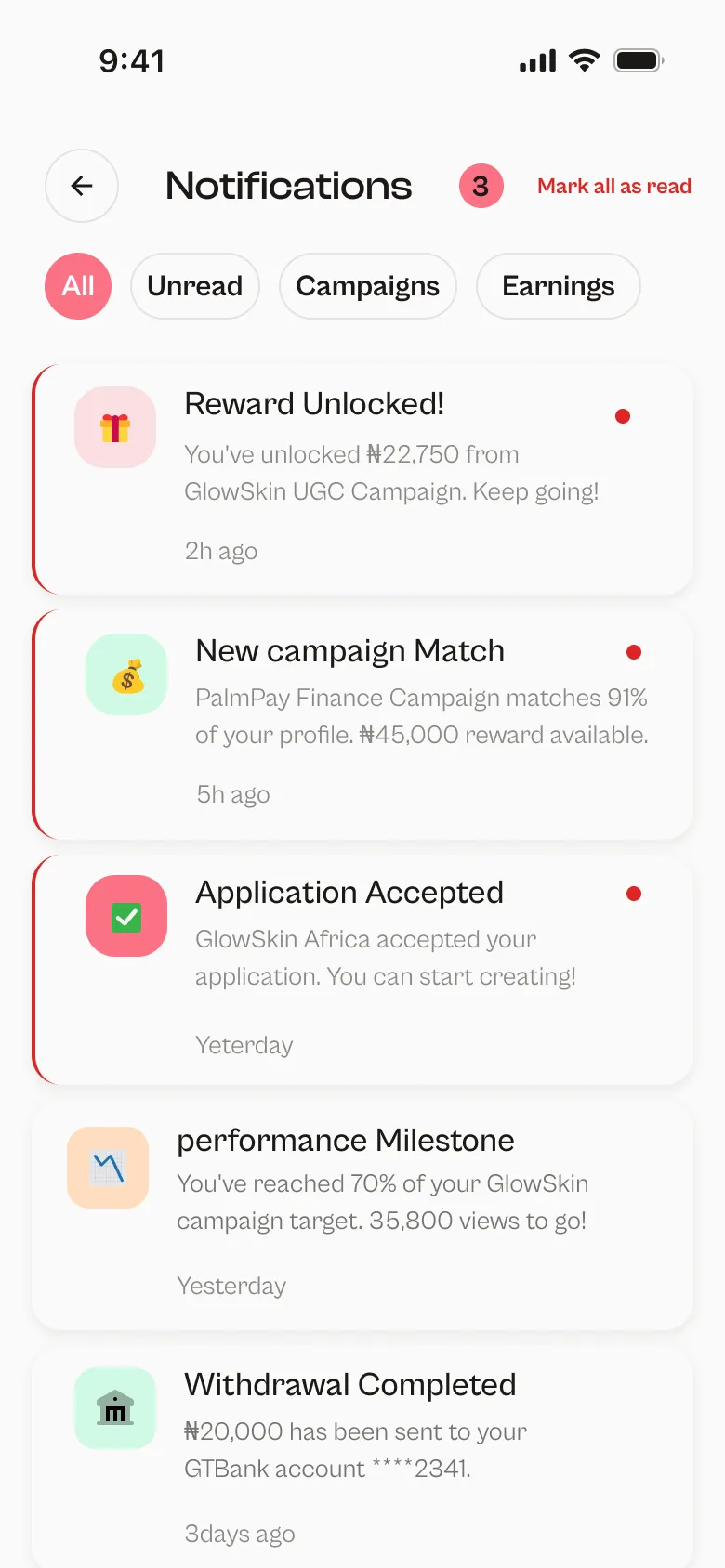
- Match scores are designed but not built. The matching algorithm was pushed to a later phase, so the badge exists in the UI but the logic behind it is future work.
Each time, I restated the decision in writing, confirmed it with the client, then updated both the screens and the documentation.
The creator experience
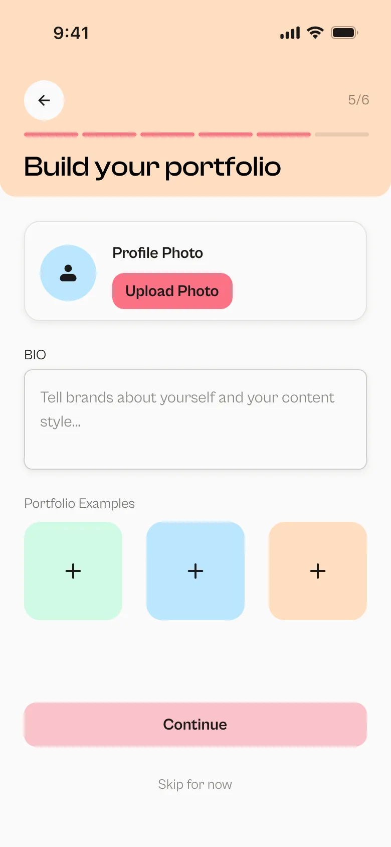
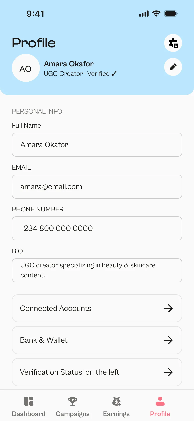
- Onboarding walks creators through choosing their role and type, picking niches, connecting their platforms and verifying their identity. If automatic verification fails, there's a manual fallback, and admins approve accounts before they can earn.
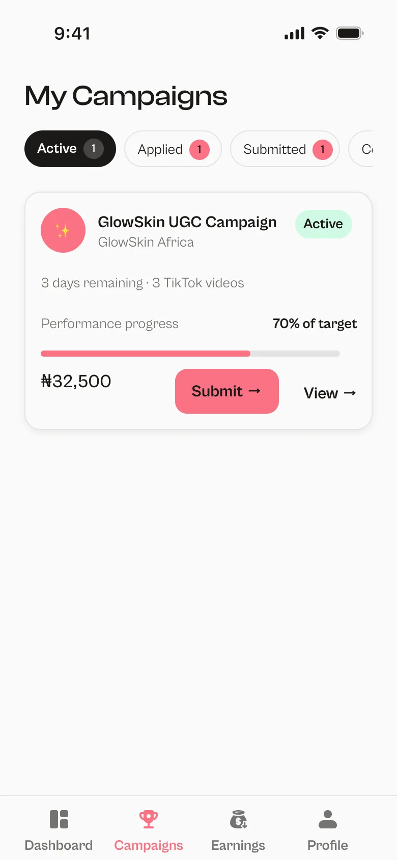
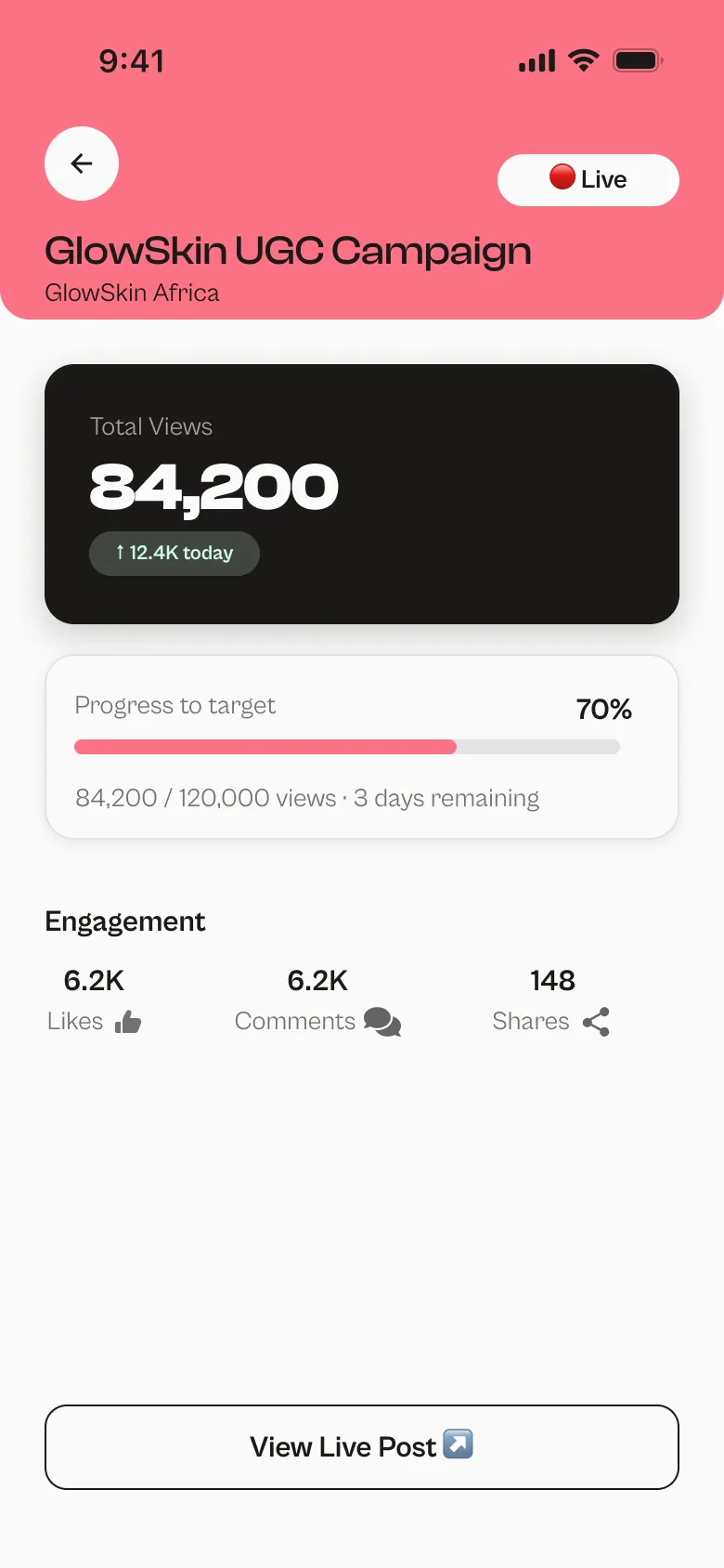
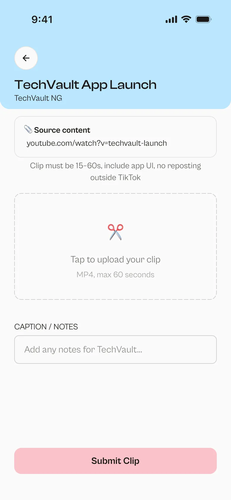
- Submissions depend on the creator type. UGC creators submit in two stages: a draft for approval, then the live link. Clippers submit once.
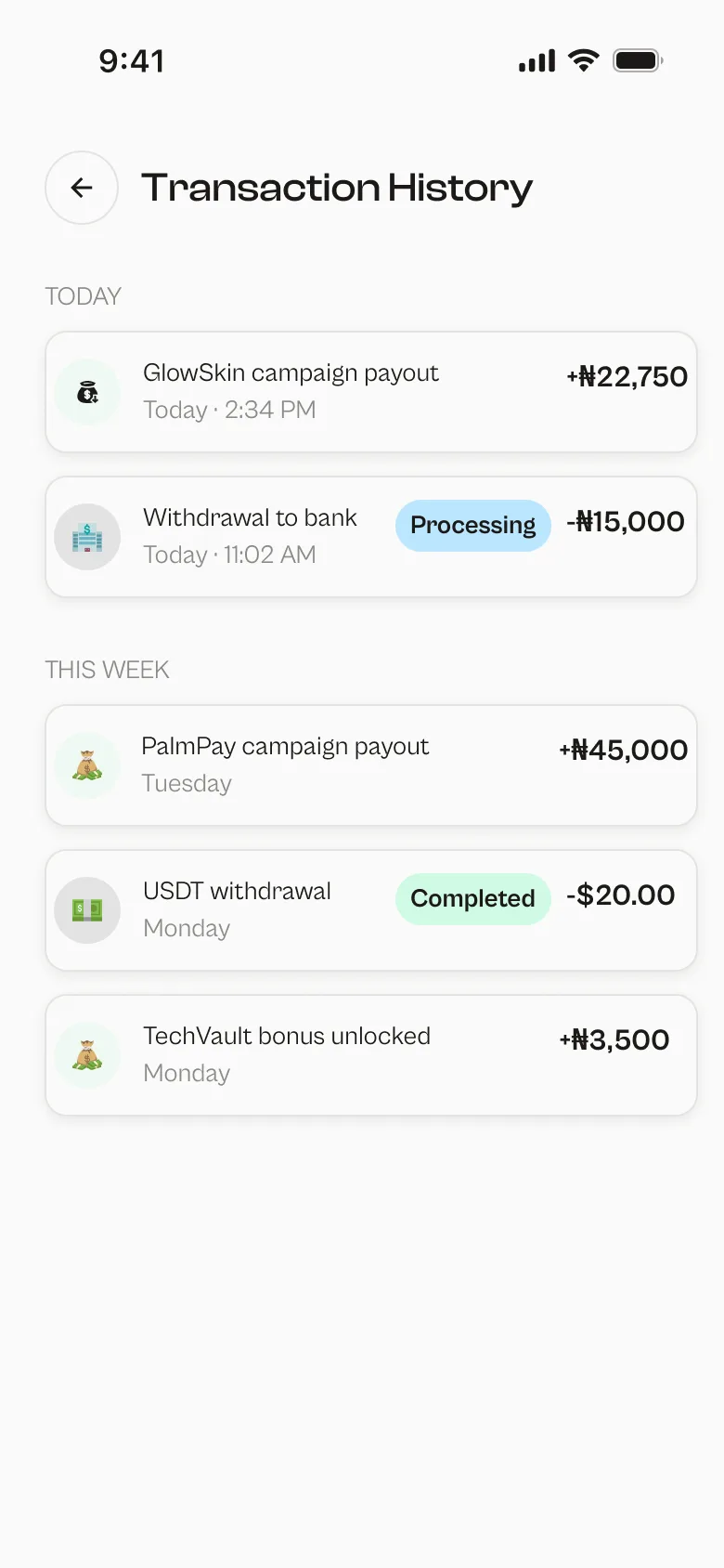
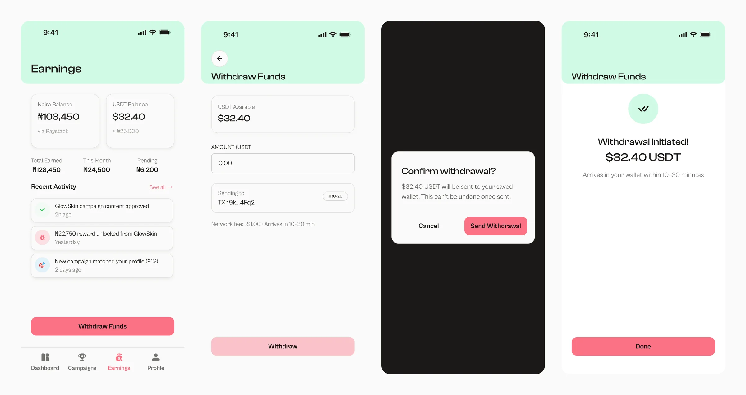
- Earnings shows balances in naira and USDT, the transaction history, and a withdrawal flow with a confirmation step before any money moves.
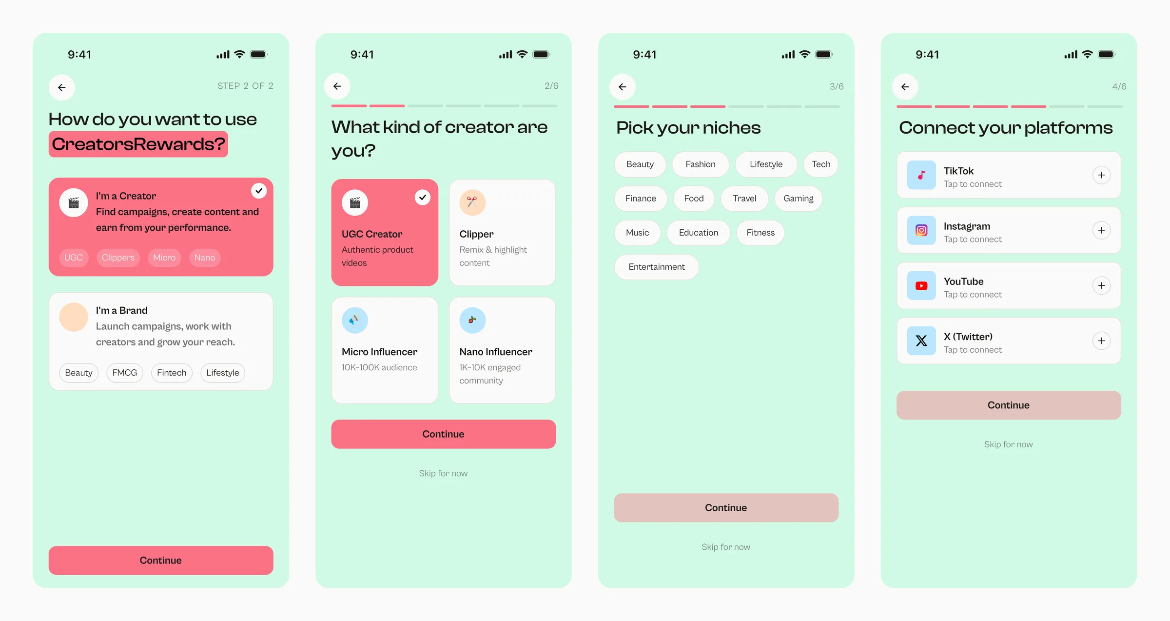
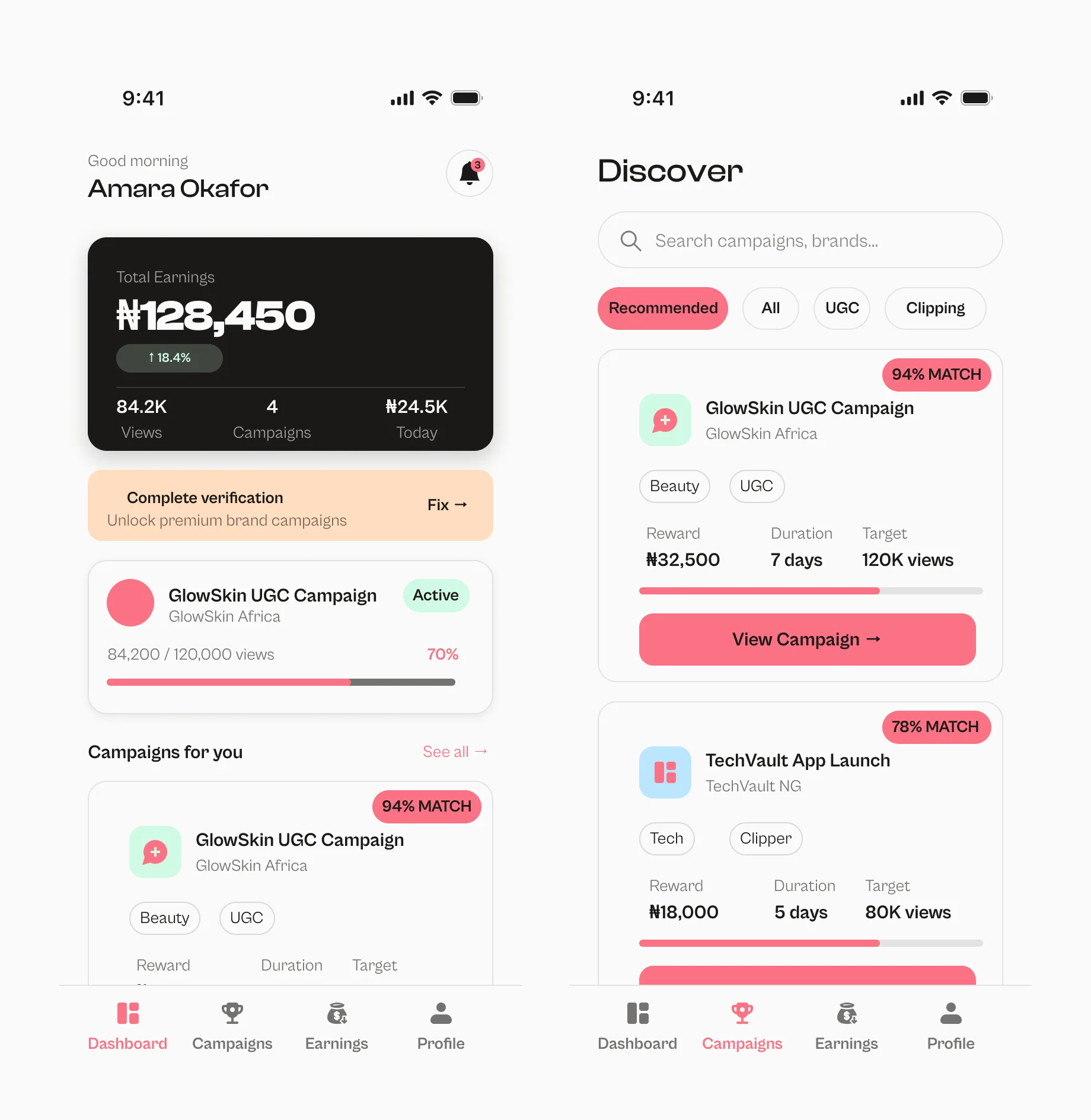
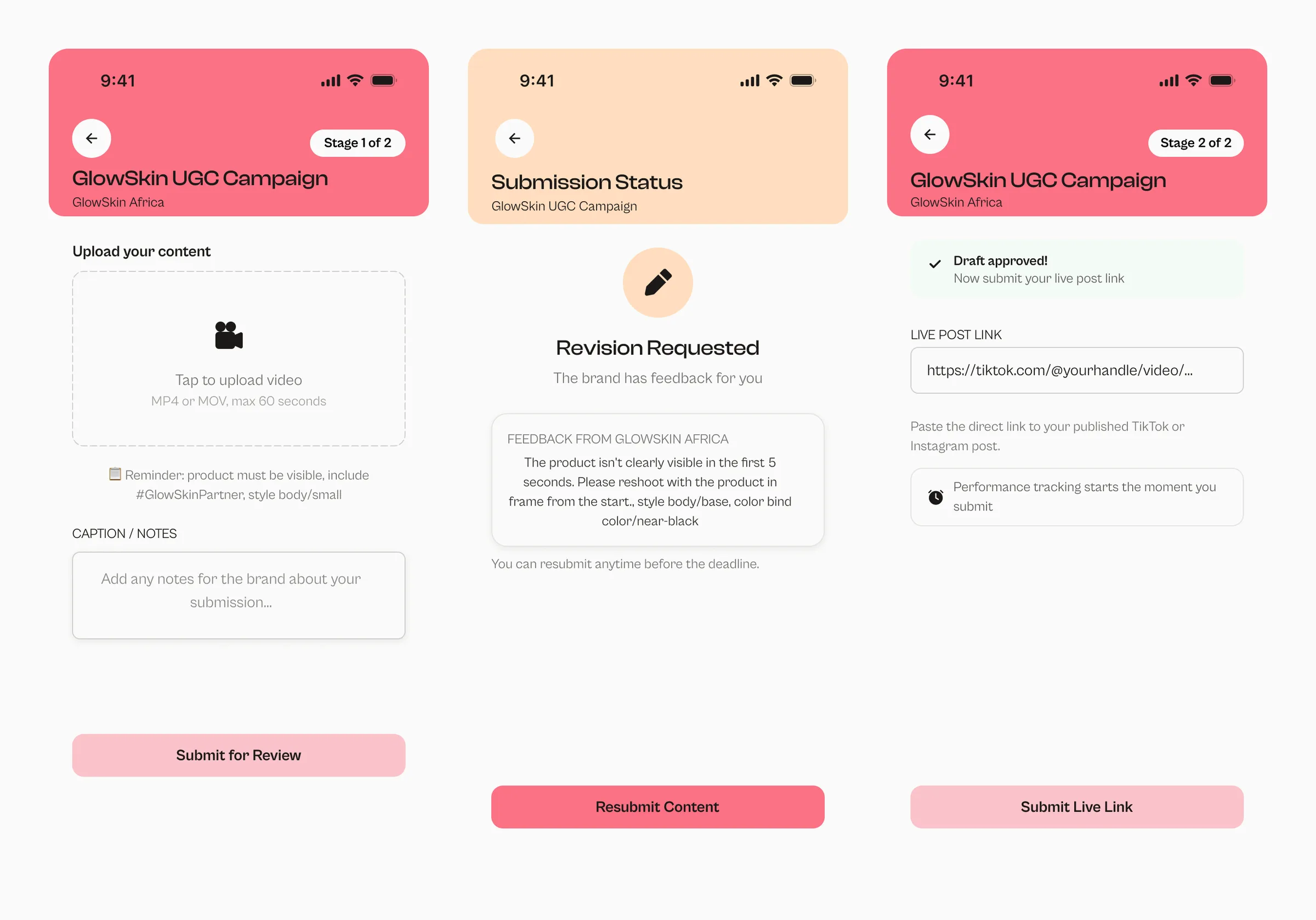
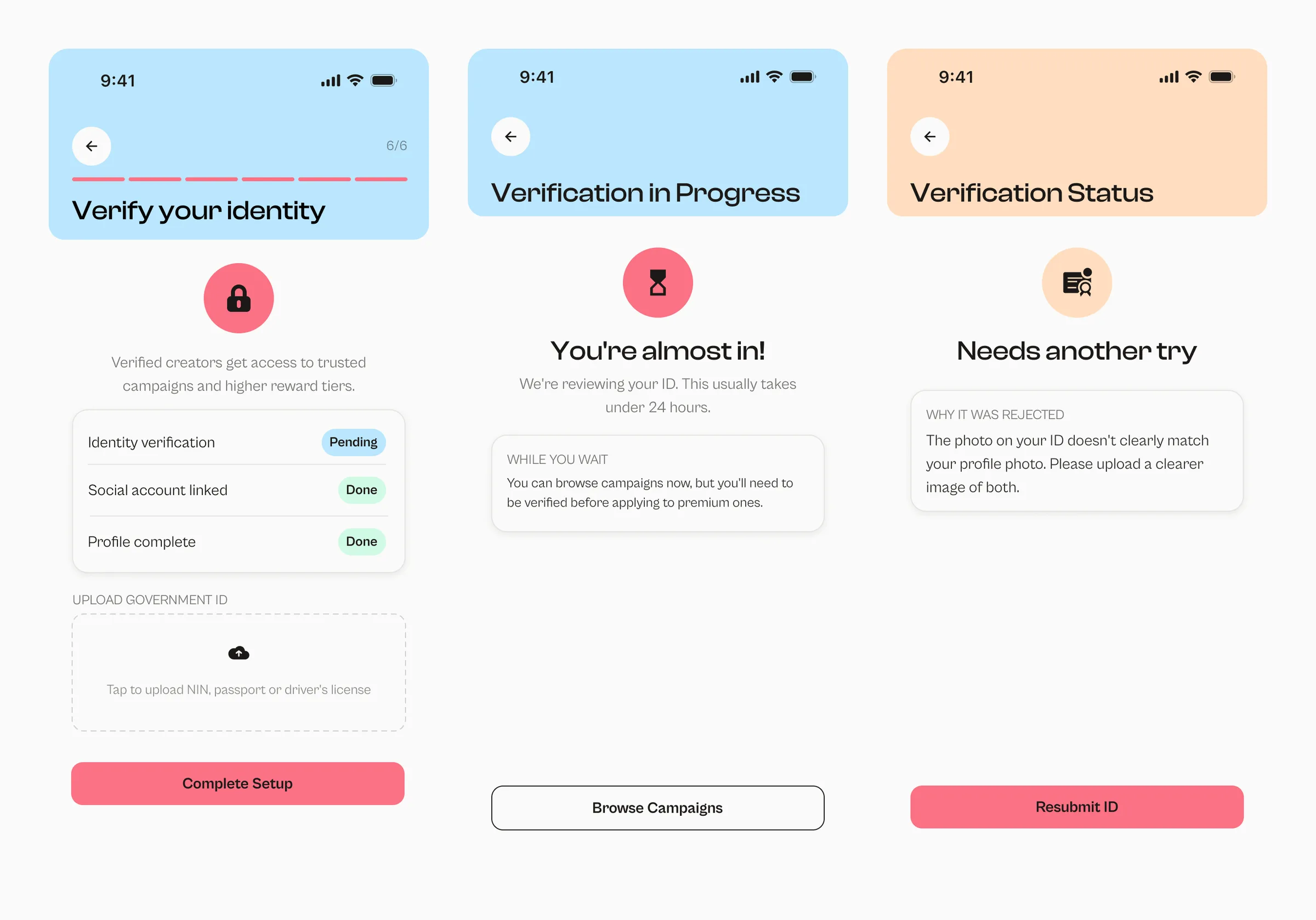
A design system built in Figma
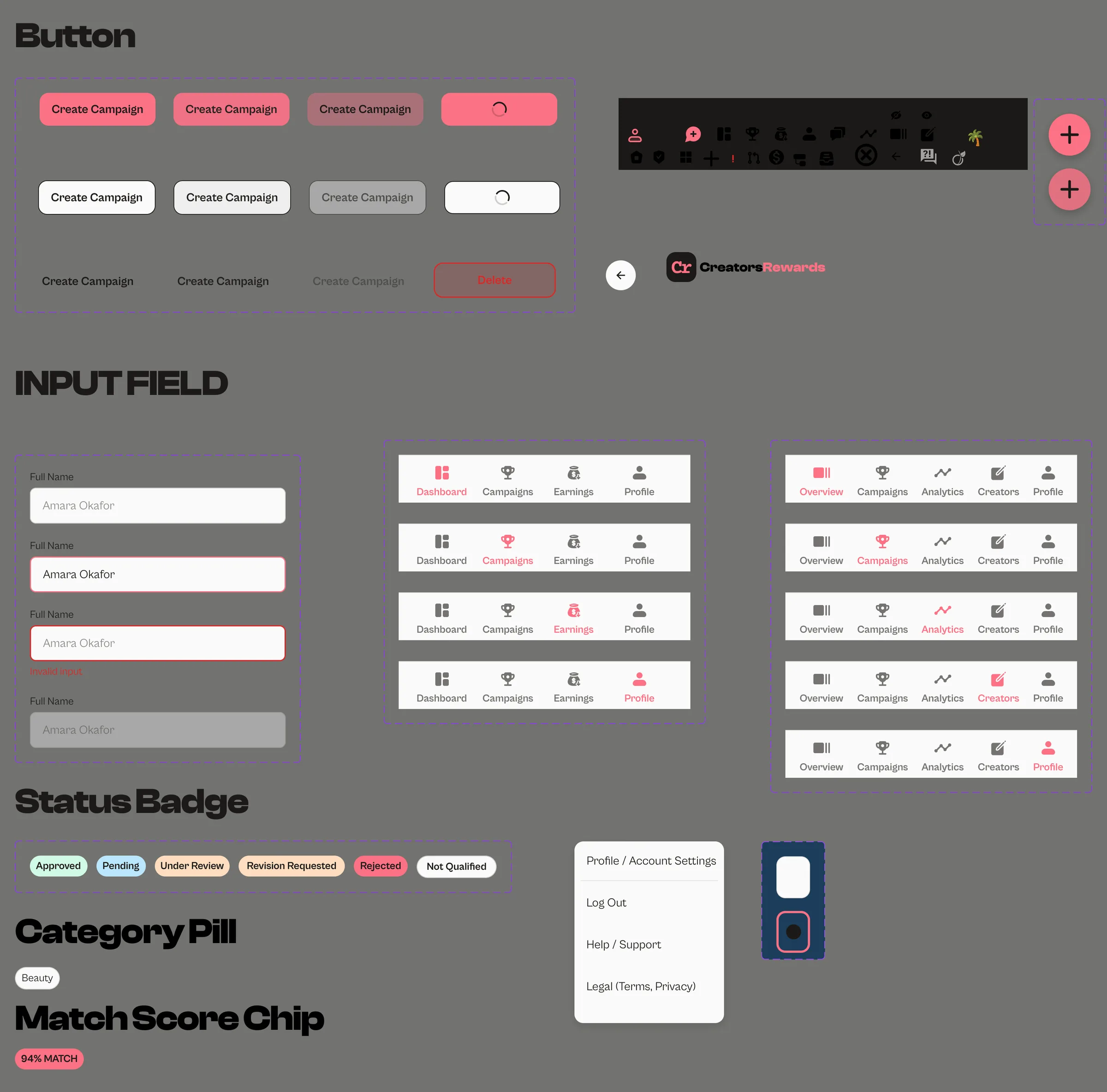
I built the system with Figma variables, so the tokens can map straight to code:
- Colour: matcha green, coral pink, off-white, near black, sky blue and peach, plus an error red added later.
- Type: Clash Display for headings and Cabinet Grotesk for body text.
- Spacing and radius tokens.
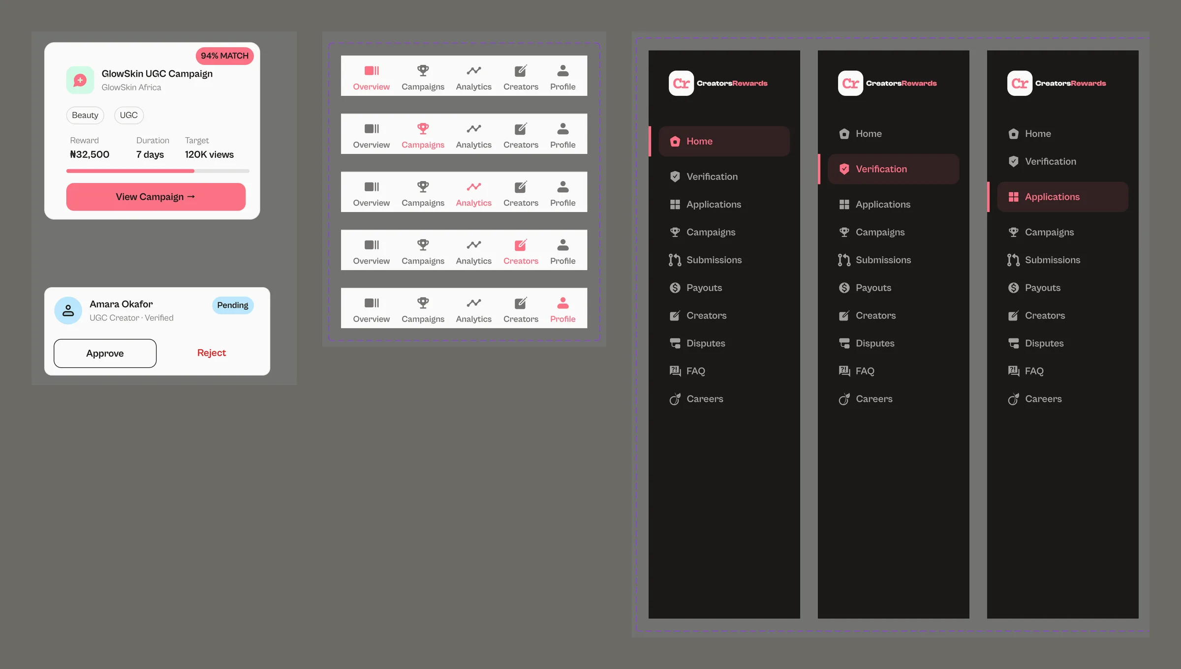
- Components: buttons with every state, inputs, status badges, campaign and queue cards, modals, tab bars for creators and brands, the admin sidebar, empty states and error states.
Accessibility: measured, not guessed
I calculated contrast instead of judging it by eye:
- Coral pink text on the light backgrounds fails WCAG AA at 2.58:1. So coral is only ever a fill, never text on a light background.
- Near-black text on coral passes at 6.5:1. Every button, badge and highlight uses that pairing.
- A coral button sitting straight on matcha green fell below the 3:1 minimum for UI components. It gets a border or sits on an off-white card instead.
- Status is never shown by colour alone. Every status has a text label, every icon-only button has an accessible name, and risky actions (rejecting, closing a campaign early, withdrawing) all ask for confirmation.
The audit before handoff
Before handing over, I audited the whole prototype. I found:
- Screens nobody could reach: Forgot Password was a dead link, Logout was built but never placed, and the clipper and influencer submission screens had no way in.
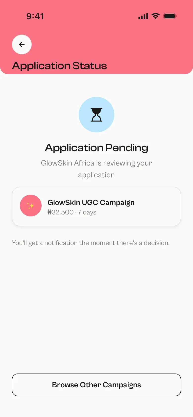
- A logic bug: "Complete setup" jumped straight to a fully verified home screen, skipping the admin verification queue. I added a Verification Pending screen in between.
- A back button sitting inside the status bar, overlapping the progress bar. I moved both into one row below the status bar.
- Five onboarding screens in a row with the same flat background. I introduced a coloured header band that rotates colour by section.
I also checked every back button and gave it an explicit destination.
Where it stands
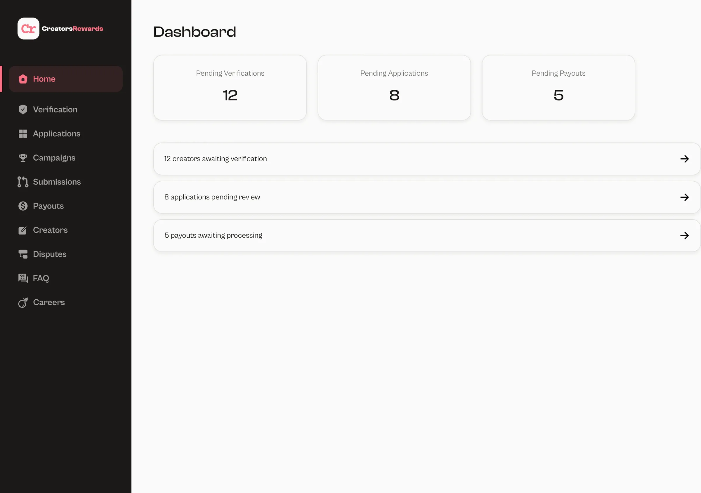
- Designed: the Creator app (44 screens, all wired into the prototype) and the Admin screens for desktop.
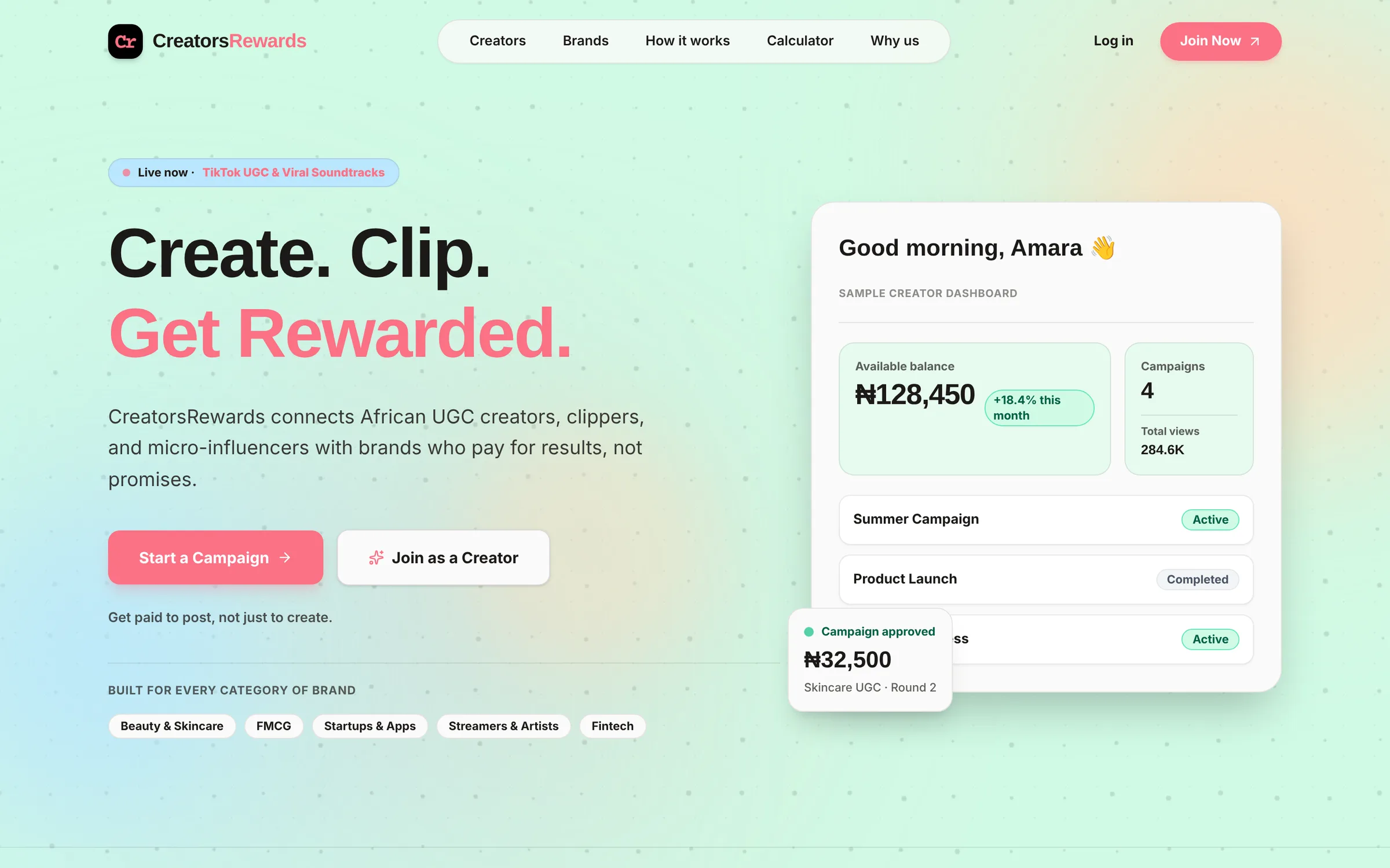
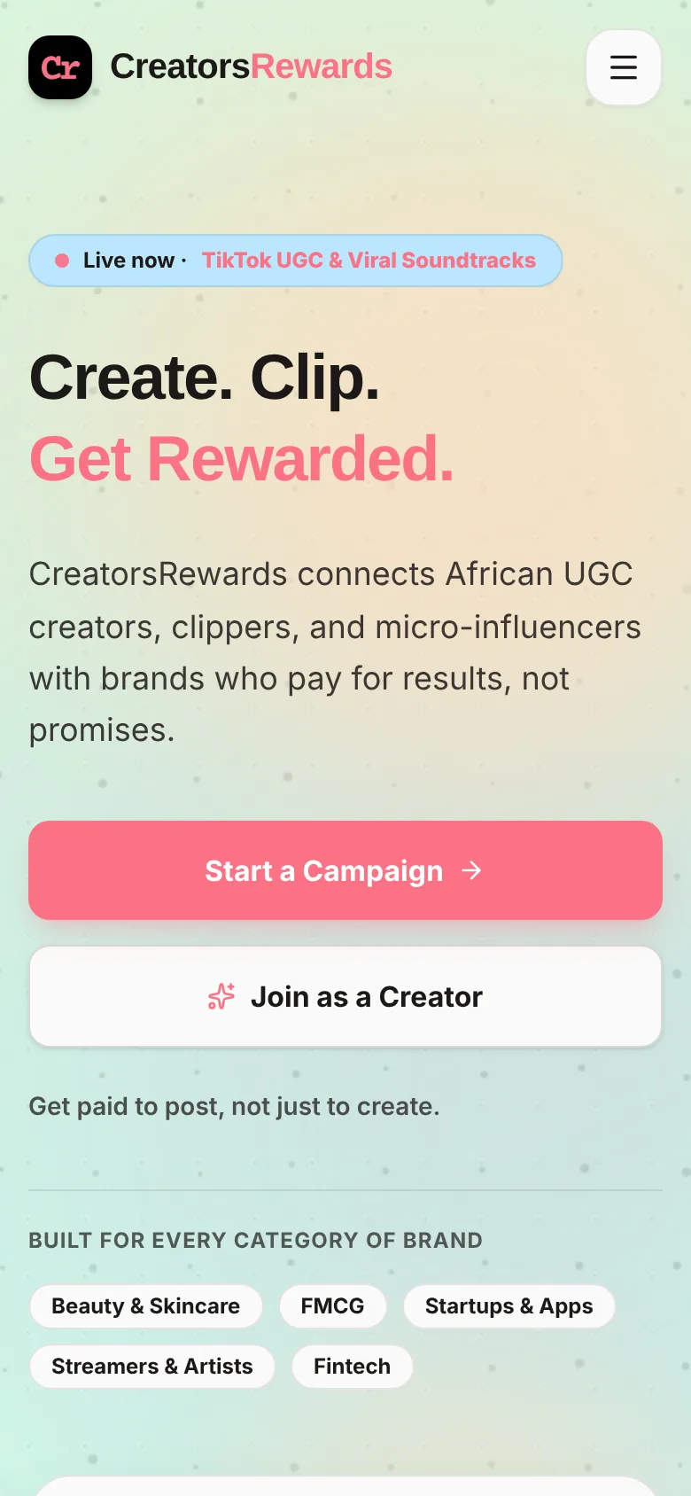
- Built: the live site, in collaboration with my friend Gomez Praise.
- Still to design: the Brand app, which is planned and specced, and the public marketing website.
- Not done yet: usability testing with real creators. That's the next step I'd push for.
The client approved the final designs, and development of the app is starting soon.
What I learned
- Writing decisions down is the design work. Every reversal was cheaper because the IA, flows and documentation already existed to update.
- An audit finds the problems a happy-path prototype hides.
- Accessibility is easier when you treat colour as a rule ("coral is a fill, never text") instead of a judgment call on each screen.